Final Project Evaluation

I felt like it was a true honor to work with A Wider Circle for the final project.  The organization does fantastic things, and you couldn’t find a more passionate leader in the world than Mark Bergel.  Having Mark come speak to us initially pre-production worked really well.  Mark was very motivating and did a very good job of explaining the severity of the poverty issue along with how organizations and people can help combat it.  I also thought it was great being able to meet with Mark a second time in a small group to discuss issues related to our final projects.

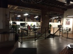
Initially, my role was to be part of a three-person team that went to the warehouse and shot photographs.  The photographs were both for other students to use in their projects and for us to then transform into a ten photograph photo series.  However, unfortunately, it was my first time using the type of camera I rented from the AU media center and I wasn’t happy with the overall quality of the pictures I took. A few photos did turn out okay and one student was able to use one of my photos in her project.

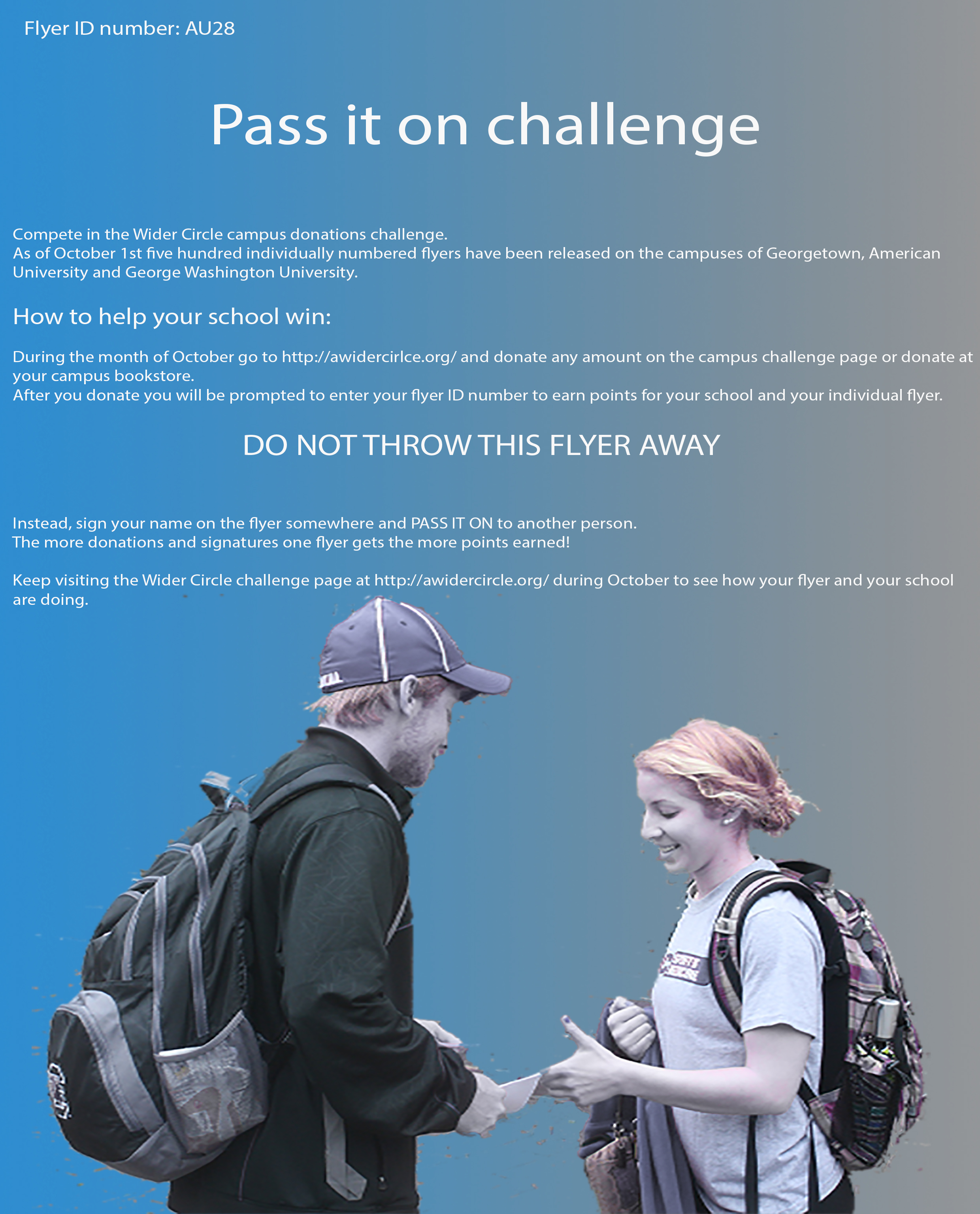
I wanted to deliver something to the client that was of use and I felt as though I could do a better job coming up with an idea for a flyer campaign than by reshooting pictures at their warehouse. I spent a fair bit of time thinking about the sociological and psychological aspects of a campaign that could differentiate it from other flyer campaigns.  In the end, I think I came up with the beginning stages of a campaign idea that utilizes some unique sociological principles.

For the campaign I used Photoshop to create the flyer.  It was my first time using Photoshop, so it took a fair bit of time for me to create something that a more experienced person could have created more quickly.  I also wrote a page to go along with my flyer and help explain how the campaign is intended to work.   Given that it was my first time using Photoshop I thought my original flyer was a decent start.

After the client viewed my original flyer they made some suggestions as to how I could improve it with some language and small formatting changes. They were good suggestions and I think they make the campaign and the flyer stronger.  I added some language to the flyer to make the campaign feel like it was going deeper than just a competition to collect signatures. I also changed the text so it doesn’t go across the entire page.  I got rid of the back of the flyer and moved the A Wider Circle logo to the front of the page.

Unfortunately, the photograph I used in the original flyer was taken from the Internet and was therefore not high enough quality to use in the final version.  The photo I used in the final version is meant to be a placeholder for now.  Even though it’s a good photograph of two volunteers passing along furniture, I still think it would be better to use a picture of students passing along a flyer for the final product.  Also, I think that removing the background completely and just using the image of the two people passing the flyer, as I did in my first flyer, looks better than just having a regular photograph.

Overall, I think my final flyer looks okay.  I think the alignment of the text now that it is in columns look nice. As well, the official logo jpg that I used from our class files had the writing too close to the edges of the photo. This is something I wouldn’t have noticed before I took this class. So I drew a white rectangle box behind the jpg and it looks better than without it. The blue, white and grey colors used in the flyer go with the blue, white and grey colors of A Wider Circle’s website. The colors of the background of the flyer also nicely match the colors of the C’s in the wider circle logo used at the top of the flyer.  Also, even though it is just a place holder, the blue tones in the photo work well with the rest of the colors in the flyer.

I can’t say enough about the support Professor Llerena gave me throughout the process, including meeting with me several times in office hours to discuss my ideas.  I came into this class deathly afraid of anything to do with visual literacy. I waited until my very last year of college to take this course, which is a requirement for my degree.  While I still feel like I have a long way to go, I feel like I definitely have the beginning tools needed to create and evaluate visual media.

Josh_Mitchell_Flyer_Revised

Setting Up Your Shots Blog Post

My film genre was classic silent film. I had to work quickly as I only had my actors for a very short period of time.  I wrote a script the night before, but I didn’t intend for my actors to have to memorize it, since it was going to be subtitled and without sound.  In the end, the script was too long and a lot of the techniques I tried to show off (such as fill frame reveal) ended up on the cutting room floor, as they just didn’t mix together cohesively.  All in all I am still missing one camera movement but I managed to get a pan, and a draw -in as well as a draw- out.  As for editing techniques I used a straight hard cut transition, a jump cut, a multi take and a freeze frame.  For shots I used a bird’s eye, a close-up, a tracking shot and a tension to camera.  I would say that the most effective technique I used was the tension to camera, where Maxine, the somewhat devious protagonist, turns her head and looks directly at the camera to end the trailer with a freeze frame and an uneasy cliff hanger question.

My original script was somewhat different, but was changed to work with the clips I had.  I knew I wanted to end on a cliff hanger moment as a sort of homage to The Perils of Pauline (1914) silent movie serial where each episode always ended with unresolved danger.  Also, at first I tried to use the sound of an old movie projector as my background score.  However, it got irritating very fast and the movie worked better scored to some old ragtime piano music, which was fitting because the silent movies were accompanied by an actual pianist in the theater. Overall, I’m not sure if my editing did my two amazing actors justice, but I still learned a lot as I started this with absolutely no Final Cut Pro Skills at all. Even though there are definitely a lot of weaknesses, hopefully the trailer still makes people want to come out and find out what happens to Maxine.

Painting To Life: Group Plan

Painting To Life: Group Plan

  • Group Roles
    • Editing- Jacquie
    • Directors- Josh, Tanner
    • Camera- Josh, Tanner
    • Writer- Paulina
    • Actors- Paulina, TBD
  • Timeline
    • Saturday, April 4th @11:00 am (meet in SIS)
      • Additional writing, filming
    • Sunday, April 5th @11:00 am
      • Additional filming, preliminary editing
  • Work of Art
    • Mona Lisa
  • Basic Plot Outline
    • Chance encounters between two people in various locations on campus
      • Mutual tattoo sparks interest
    • Too shy to speak with one another
    • Continue to see each other on campus
    • Eventually sees the other with someone else
      • Deters the other
    • Meet and hold hands in the end
  • Shot List/Storyboard/Scene Locations
    • Storyboard
      • SIS
        • See each other for the first time
      • Quad
        • Bump into each other
      • Library
        • Quiet floor hijinks
      • Amphitheater
        • Girl with what looks like a boyfriend
        • Boy leaves discouraged
      • Katzen
        • Boy stands in front of a painting, girl joins, hold hands

No Country for Old Men Scene Deconstruction

The section I chose to deconstruct from No Country for Old Men is 53 seconds long and starts at 40.30 with Llewelyn  pulling up to his motel in a cab at night time. The scene starts with a medium close up on Llewelyn’s face with him looking concerned as he sits in the back of the taxi and appears to be focusing his attention out the window toward the motel that they are approaching. We then get a tracking shot looking out through the windshield and showing that they are approaching the motel and turning to drive past the motel rooms. They then use a match cut and a mid-close up shot from the front of the car looking into it that shows both the taxi driver and Llewelyn in the car. In the background we can see blurred movement out the window to illustrate that the car is making a turn. They then cut away to a dolly tracking shot which pans the motel rooms as they drive past.  There is a cut away shot where we see the different motel rooms as they pass (sort of a look at shot as well) and then a match cut back to a close up of Llewelyn’s face as he looks, concentrated on the motel, out the window.  Next we get another cut away shot that becomes a dolly tracking shot of the motel rooms as they drive by and the camera speed slows down as we pass one motel room with the window shades just slightly open. There is then a quick match cut back to Llewelyn’s face and then another cut away which this time is clearly a look at shot as the camera slows and slightly zooms in on the motel window which has the curtains slightly drawn, and then quickly back to Llewelyn who asks the driver to immediately take him to another hotel.  This action sequence clearly signals that the motel window that we have just seen has caused Llewelyn’s reaction.  There are a few quick match cuts back and forth between Llewelyn and the driver of the taxi as they talk for a few seconds and then the scene does a straight cut.

The straight cut brings us to a dolly down shot of a close up of the camera speeding over the highway which is used to emphasize the speed of a car as the road moves beneath it. We then get a match cut to a medium close up of Anton’s face looking forward as he drives. This creates cinematic tension as we can tell that Anton is fast on Llewelyn’s trail.  There is then a match cut to outside the car, where the camera stays in one spot and we can see the car drive by and also see, on the right hand side of the screen, a Del Rio road sign which lets us know that Anton is heading in the right direction to find Llewelyn.  Then they use a crane up technique as the car continues to drive, which pans out as the car gets further away from where it’s being filmed and allows us to see the car continue to travel towards Del Rio.

Artists Statement for My Photo Series

I filmed most of my pictures in the middle of the night.  At first I just liked the idea of things being shut down and closed and I thought that might be the theme of my project. Our teacher recommended I look at Brian Ulrich’s photos of abandoned department stores and malls; which I did and I found them to be spectacularly cool. I also thought about Todd Hido’s photographs where he photographed homes he had snuck up on late at night.  What I love about late night city shots is there is the loneliness of abandonment combined with the promise of life in the future when the city wakes.

After reviewing my photos I kept coming back to the guy sleeping at the bus stop.  I liked the idea of him dreaming of escaping his life in his imaginary car. Driving to a beautiful hotel to spend the night and awaking to a new job and a new life.  But quickly he starts to come back to reality and Maslow’s hierarchy of needs, whereby he realizes that his immediate needs are to find something to eat and drink along with temporary shelter.  The fact that most of the places he looks at in his dream are closed is symbolic of the fact that much of the world is largely closed off to him.

Photo Series Project ( Homeless dreams)

Client Research Post

I’ll be honest, I had started this project in class and saved a copy, and somehow it didn’t save properly so I had to start again. I realize that I don’t really know what I’m doing with illustrator yet and I was fortunate with trial and error to even get back to what I have now.  What I did create is a draft of a cardboard or paper coaster which hopefully some bars would be willing to use.  While I do think the actual coaster could use some improvement, I do think the concept of creating coasters does fulfill a visual need for our client.  It creates a type of flyer which will stay in front of people for a long time and perhaps target people at a time when they might feel reflective and be wondering about ways they could make their lives more fulfilling. It is purposely simple and consistent with the client’s message which is; if we want to end the larger issue of poverty we need to start tacking it on an individual basis. It is also consistent with the organizations need for help from concerned citizens. To be honest, even if I was a master at Adobe Illustrator I would still keep the coaster very simple.  I think it should look professional but not too professional if that makes sense.  I want the coasters to feel like they were created by real people as part of a grassroots movement and not just paid for and designed by some large professional design outfit.  At the same time, I want to make sure the client feels like they look good enough to represent them.

coaster7